CPR in Seconds: On-demand CPR Responder Registry
CPR Save App is a CPR responder registry app based in Santa Monica, California. They are focused on educating users on the steps to perform CPR, growing a network of those individuals and as a result providing the opportunity for responders to help someone in a cardiac-related emergency.
The Challenge
Train more civilians on CPR and increase downloads of the CPR Save App.
The Solution
Update the mobile UI of the current site that made it easy to learn CPR, take a quiz to validate that knowledge and then prompt the user to download the application to join the network.

CPR Save is still in its early stages of beta testing, but it currently lacks an online presence to promote awareness. The goal of the website is to assist individuals to successfully learn CPR and become responders for the app. This flow will encompass CPR Save's core ethos by translating it into a memorable and engaging experience.
To gain a better understanding of how to best attract users, we conducted a C&C Analysis, Interviews, and Market Analysis to help formulate our initial plan and methodology.
01 RESEARCH
C&C Analysis

Key takeaways:
Building a community feature around the network where users can interact and share stories would lead more users to download the app and join the network
There are a series of myths around administering CPR that prevent people from taking action
Having the confidence to give CPR is a big of an issue as not knowing how to give CPR
01 RESEARCH
Market Analysis
The focus of the mood board we created was to follow modern UI trends (round, flat UI) and to find designs that were optimized for one-handed use by incorporating a card-style UI and large assets.

01 RESEARCH
Color

When choosing a color palette to correspond with our emergency response product, we thought of what current emergency response products use so naturally we were drawn to colors like Red, White and Blue.
01 RESEARCH
User Interviews
Here are some key takeaways:
Building a community feature around the network where users can interact and share stories would lead more users to download the app and join the network
There are a series of myths around administering CPR that prevent people from taking action
Having the confidence to give CPR is a big of an issue as not knowing how to give CPR
“Empowerment means being able to write your own story.”
“Knowing something is better than knowing nothing at all.”

The goal of our Ideation phase was to make some tangible sense of the research we we gathered. We started by creating our initial sketches and strategic approach.
02 IDEATION
Sketches

Based off of our competitive analysis and user interviews, we generated a few solutions to solve the problems found in each research method:
- Organize inventory
- Clean-up website
- Create bold visual elements
- Adding social features
- Creating user profiles
Our biggest finding wasn’t an issue we currently had, but rather it was a feature that we lacked and that the users demanded, like user profiles and social features.
02 IDEATION
Double Diamond Method

Based off of our competitive analysis and user interviews, we generated a few solutions to solve the problems found in each research method:
- Organize inventory
- Clean-up website
- Create bold visual elements
- Adding social features
- Creating user profiles
Our biggest finding wasn’t an issue we currently had, but rather it was a feature that we lacked and that the users demanded, like user profiles and social features.

Our initial prototype took the mobile context into consideration: Card-style and rounded UI Optimized for one handed use, and a mobile context. Once we decided a direction to go in after our Ideation page, we started to put those strategies into concrete by creating out initial prototypes. Like we found out, our users demanded features like user profiles and a community feature where they can interact with and meet each other.
03 PROROTYPING
Profile Screen
Because of our new social features, we needed a robust profile feature to compliment that and to give the ability to develop a following on Fuloop as a fun-finding individual.
Users will log on to the app and post pictures of themselves at the event, and will be rewarded with digital points that can be redeemed for prizes and


Further refinement was made with mid-fi wireframes. We ran multiple usability tests and found out our call-to-action was not grabbing the users attention as intended.
As a result, our home page was refined until our CTA was screaming, INTERACT WITH ME!


Combining all of our research, customer and client feedback, our final prototype was created to draw the users eye towards our CTA, create a sense of urgency to act, and have a color pallette that represents and brings up feelings of emergency response.
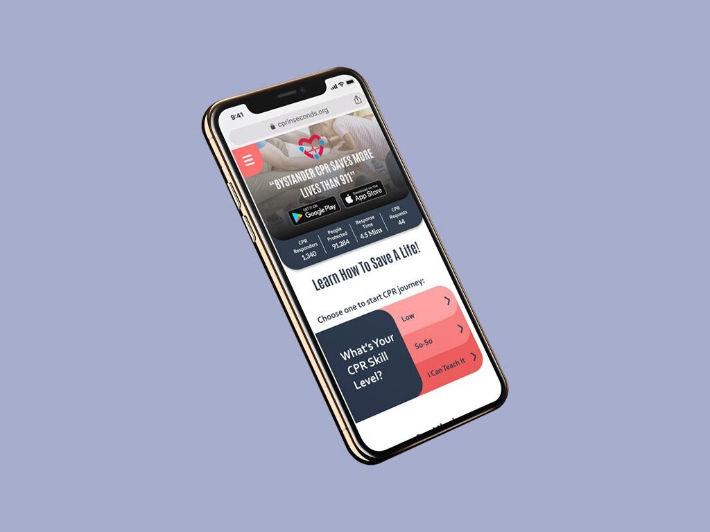
04 FINAL PROTOTYPE
Final Home Screen
Old Home Screen

New Home Screen

04 FINAL PROTOTYPE
Final Menu
Old Menu

New Menu

Added Screens
04 FINAL PROTOTYPE
Community Feature


04 FINAL PROTOTYPE
CPR Performance, Facts, and Figures


04 FINAL PROTOTYPE
Quiz

