Intrepid Travel: The world’s premiere small-group travel company
Intrepid Travel is the world’s largest small-group travel company that focuses on delivering curated, plan-free travel experiences.
The Challenge
Redesign website to attract users between the ages of 29 and 49 while streamlining the search process associated with finding a specific trip in less than 3 screens.
The Solution
Revamp creative direction of website in terms of branding, color palette, fonts, and UX process.

Intrepid Travel wanted us to attract people between the ages of 29 and 49. To do that we conducted market research, personal interviews, hueristic, task and competitive analyses. Here is what we found out:
01 RESEARCH
C&C Analysis
According to our analysis findings, intrepid travel succeeded at doing 2 things: having trustworthy travel experiences and targeting a older demographic. However, we saw opportunities in the marketplace that we could take advantage of that would open us up to more opportunities, like giving the ability to adjust your accommodations and providing activities for an older audience to enjoy.

01 RESEARCH
Market Analysis
We scrubbed the reviews of the site and conducted a market analysis on the global travel industry, and found out some things about how our current users were behaving, and how travelers on a global scale behave:

01 RESEARCH
User Interviews
Over the course of our 2-week sprint, we interviewed 14 individuals between the ages of 22 and 39. These three quotes summarize the majority of our findings.

01 RESEARCH
Site Analysis
We combined our user interview findings with site heuristic analysis, and overall we found quite a few snags in their initial landing page. Users landed on the site and immediately saw images of young people on a trip and thought that the trips would be aggressive and too intense. Also, we lacked a feature that all of out competitors had, which was the ability to search for a trip immediately by date. The messaging is vague, and the video shown to promote the site and its offerings has been proven to be ineffective versus other methods.

Another annoying situation our users found themselves in were seemingly infinite “scroll holes” where the user was given all possible trips to a region at once, with no option to filter them by month, time, offerings, etc. Because of that, if you wanted to book or view a trip 2 years out, you would have to scroll through hundreds of other trips before that time.
After a heuristic, task and competitive analysis, we found out the pinpoints and insufficiencies in their current site:
Can’t sort by date
Tons of clicking to find right trip
Exclusive imagery and unfavorable aesthetics
No explanation of trip intensity
Does not elaborate on lodging or accommodations
01 RESEARCH
Color
When choosing a color palette to coincide with our emergency response product, we thought of what current emergency response products use so naturally we were drawn to colors like Red, White and Blue.


After we located our market, current site issues and creative direction we aimed to use that knowledge to create our initial User Flows and UX Strategy.
02 IDEATION
Site map
When brainstorming design decisions based off our research, we kept in mind that we wanted the user to reach a specific in 3 screens. Because of that we diagnosed our current site map and and sketched a user flow that provided more detailed search options.

02 IDEATION
Sketches
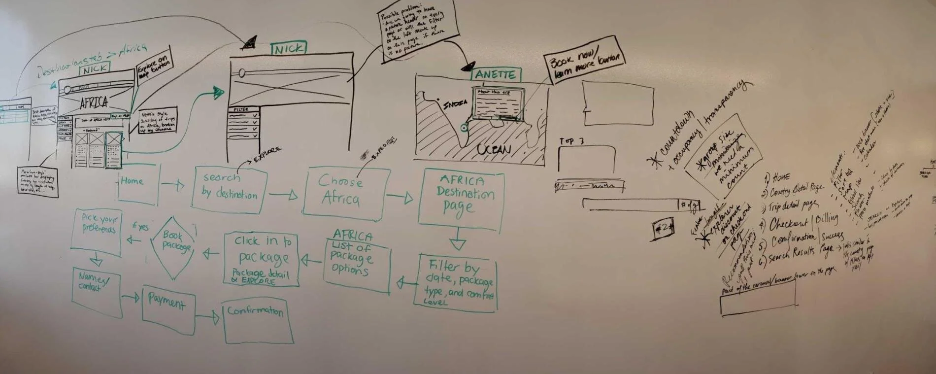
To create that streamlined and efficient user experience we knew we needed, our initial design studio focused on compacting the user flow to its simplest form.


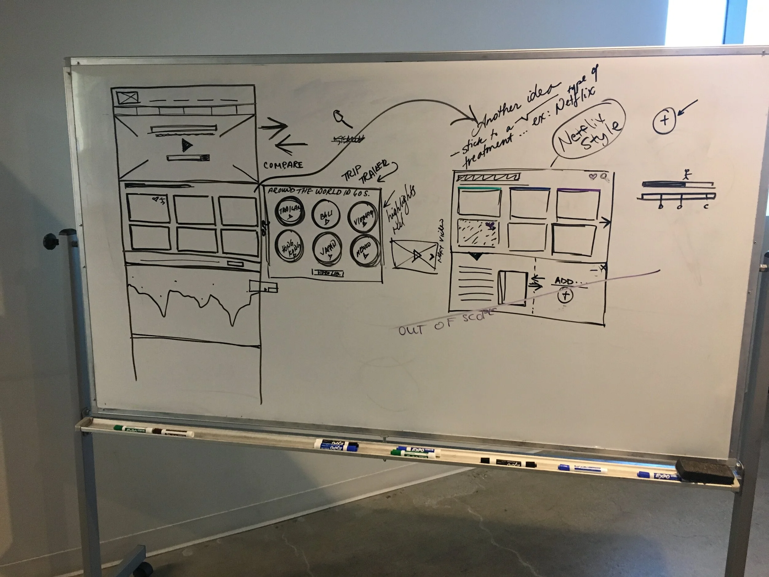

To achieve our goals, our design decisions included many drop down menus, search bars, and information architecture. We also included features that users not only wanted, but specifically asked for like a map search feature.
02 IDEATION
Affinity Map


Our findings:
Our affinity map findings showed that users “want beautiful imagery that highlights locations and people I can relate to”, “need to be able to book my trip by date”, “need to be able to easily filter and compare search results”, and they ”need transparency when making travel plans”.
02 IDEATION
Brainstorming: Double Diamond Approach

Based off of our competitive analysis and user interviews, we generated a few solutions to solve the problems found in each research method:
Organize inventory
Clean-up website
Create bold visual elements
Adding social features
Creating user profiles
Our biggest finding wasn’t an issue we currently had, but rather it was a feature that we lacked and that the users demanded, like user profiles and social features.

Our prototyping goals revolved around revising the site’s imaging to attract to a wider audience, implementing a “search by month” function, add more prominent filter options and clearly distinguish trip details.
03 PROTOTYPING
Home and Trip Screen
Our initial prototypes tried to contain the feedback from our research and ideation stage by including detailed descriptions of the trip, a more cleaned-up trip filter/search function, and more bold imagery and aesthetics.
Unfortunately, we were still having problems with an overwhelming amount of information on the screen and design issues like the alignment of text and an unclear search function.


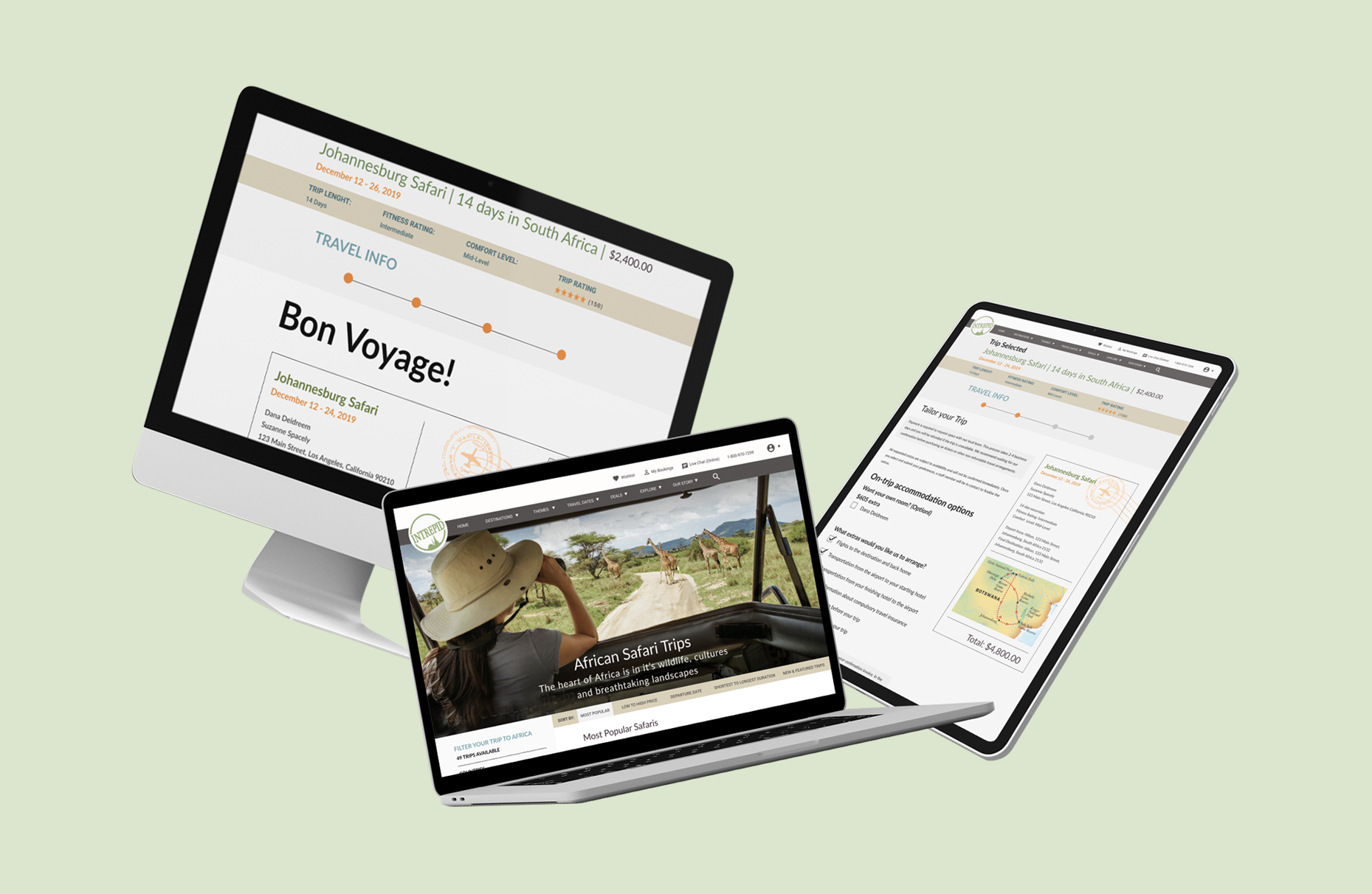
04 FINAL PROTOTYPE
Final Home Screen
Old Home Screen

New Home Screen

04 FINAL PROTOTYPE
Trip Details
Old Trip Page

New Trip Page

04 FINAL PROTOTYPE
Passenger Details
Old event selected screen

New event selected screen

