USC: Los Angeles’ top private research university.
Fighting on since 1880 ✌️
The University of Southern California, founded in 1880 in Los Angeles, is California’s oldest private research university and consistently ranks among the nation’s top educational institutions.
My role at USC was User Experience Designer, although I ended up taking up more responsibilities like accessibility remediation and design system management. At USC, I worked on a variety of projects:
Design system creation and management
ITS Service Portal redesign
Accessibility remediation of sites and apps
Shibboleth Single Sign On redesign
Custom site creation
I was also responsible for ensuring that all digital products that I’m working on are compliant to WCAG 2.1 AA standards for web accessibility.
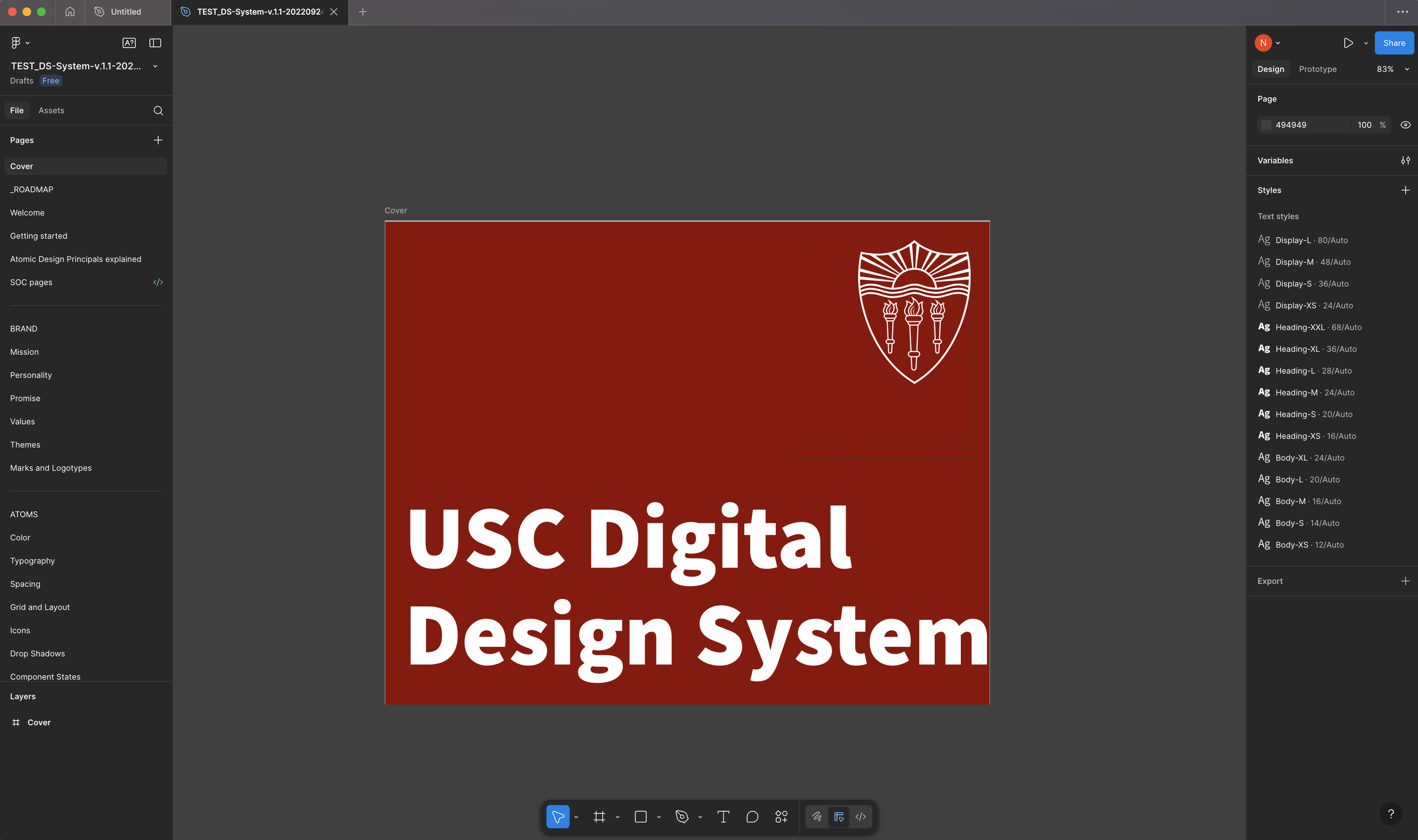
Design System Creation & Management
“A kit of UI components without accompanying philosophy, principles, guidelines, processes, and documentation is like dumping a bunch of IKEA components on the floor and saying ‘Here, build a dresser!’”
— Brad Frost
When I arrived at USC, they had the bones of a design system built out, but nothing more than copy and pasteable components. There was also a lack of direction in how the design system was organized and managed, with all components, patterns and templates simply listed in alphabetical order. To provide a more clear and logical organization for the design system, and to fully utilize all of the features Figma has to offer, I chose to take a couple of routes:
Incorporate Atomic Design Principals as a way of organizing the design system
Create a primitive library of reusable components
Utilize Styles and Variables and create primitive and alias tokens
Apply Auto-layout to all elements and components
Atomic Design Principals
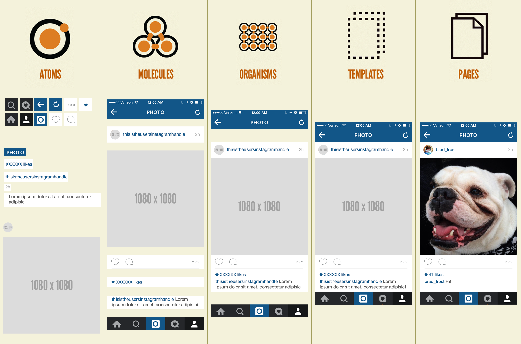
To begin working on the design system, I wanted to start by organizing it in a more logical way. I decided to incorporate an organizational structure based on Brad Frost’s Atomic Design principals. Brad Frost’s Atomic Design is based on the idea of breaking down user interfaces into fundamental building blocks, inspired by chemistry’s concept of atoms, molecules, and organisms.
Following these guidelines helped initiate a structure and hierarchy to our design system based on use case of components. This inspired us organize and use our components in a more objective manner, instead of just listing them in alphabetical order.
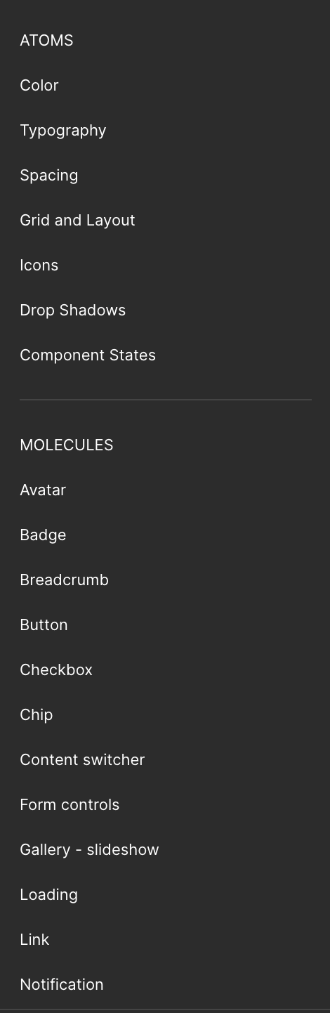
Atoms: These are the most basic building blocks of your design system. They are the most fundamental UI elements or components that cannot be broken down any further. Examples include buttons, input fields, labels, icons, color swatches, or typography styles.
Molecules: These are combinations of atoms put together to create a simple UI component. Examples include a search form combining a label, input, and button; or a navigation item combining an icon and label.
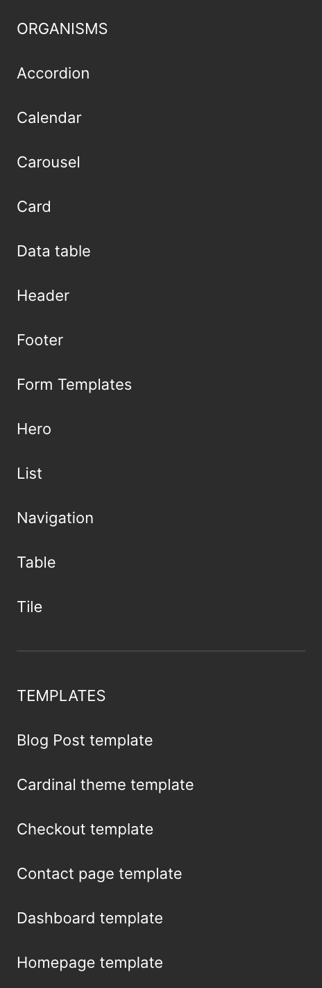
Organisms: Organisms are larger components created from molecules and sometimes atoms. Examples include a website header with logo, navigation, and search form; a product card with image, title, and CTA.
Templates: These are page-level layouts that place organisms into a structure to define the overall design and content hierarchy. They focus on the page’s underlying content structure rather than final visuals, showing how components fit together. Examples include a product checkout page, blog post template or a dashboard layout
Pages: These are specific instances of templates with real content and data filled in. They represent the final user experience and serve as a testing ground for all the system’s components working together. Examples include a live product detail page showing a real product, price, and reviews, like a final figma file shipped to developers.
Example of Atoms and Molecules organizational structure.
Example of Organisms and Templates organizational structure
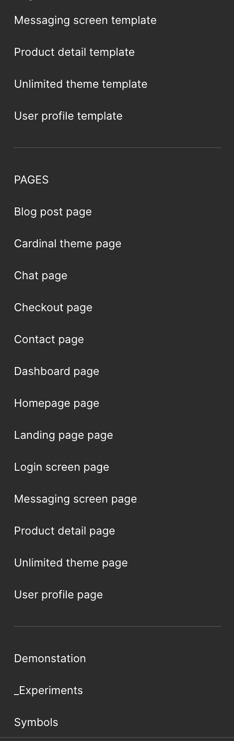
Example of Pages organizational structure.
Incorporating these design principals allowed our team and developers to have a more clear understanding of what our design language should look like, ultimately resulting in a more consistent experience across our various products and websites.
Design Tokens/Styles and Variables
Next I wanted to utilize design tokens, which later was adoped natively by Figma as Styles and Variables.
Styles: Reusable design properties that you can apply to objects like text, colors, effects, and grids.
Variables: Dynamic, reusable values that you can use for colors, typography, sizing, spacing, and even component properties. As opposed to Styles, these are more used for scalable, dynamic systems, like:
Theming (light/dark modes)
Responsive spacing
Advanced component states
Primitive variables: These are the raw, foundational variables values that your Alias Variables will be referencing. You Ypu Can think of them as the source of truth, and they should not be adjusted. They are defined directly with a value, and are usually organized into scales.
Ex: 100-900 for colors.
Alias variables: These variables reference the primitive variables, and are named semantically based on their meaning or role in the design system so the user doesnt need to memorize raw values. They just need to select the alias variable they need based the job they are performing.
Ex: “I need a primary header background color, so I will select header/background/primary”, or “I need the secondary darkmode text color, so I will select text/darkmode/secondary.”
You can also have different shades of these colors in each based on specific use cases, as in the case with USC. Not all contexts can support a single aliased variable (a third party service with ridgid design specifications like not being able to change the DOM, resulting in accessibility issues), so a lighter or darker shade may be needed to accomodate.
Ex: alert/error/40, alert/error/50.
Because of this need at USC, all Primary colors were set to …/50.
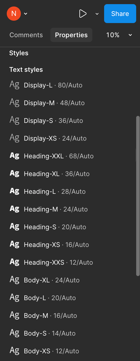
Text Styles
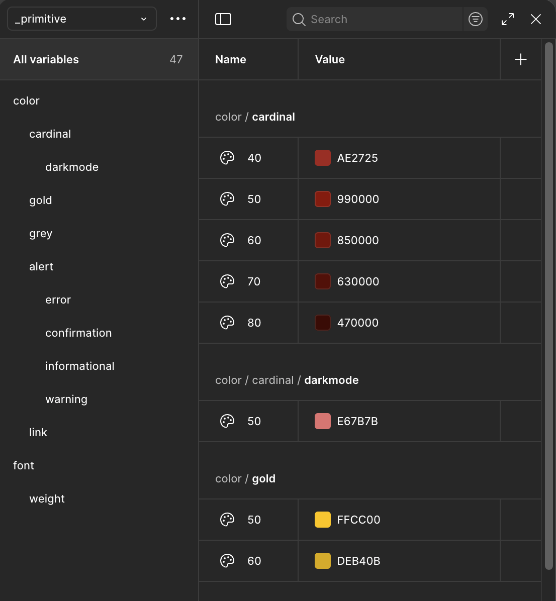
Primitive Variables
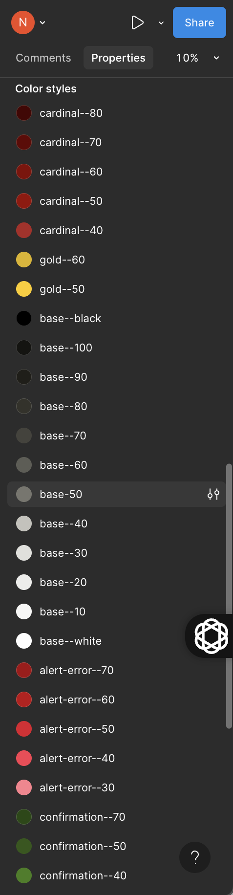
Color Styles
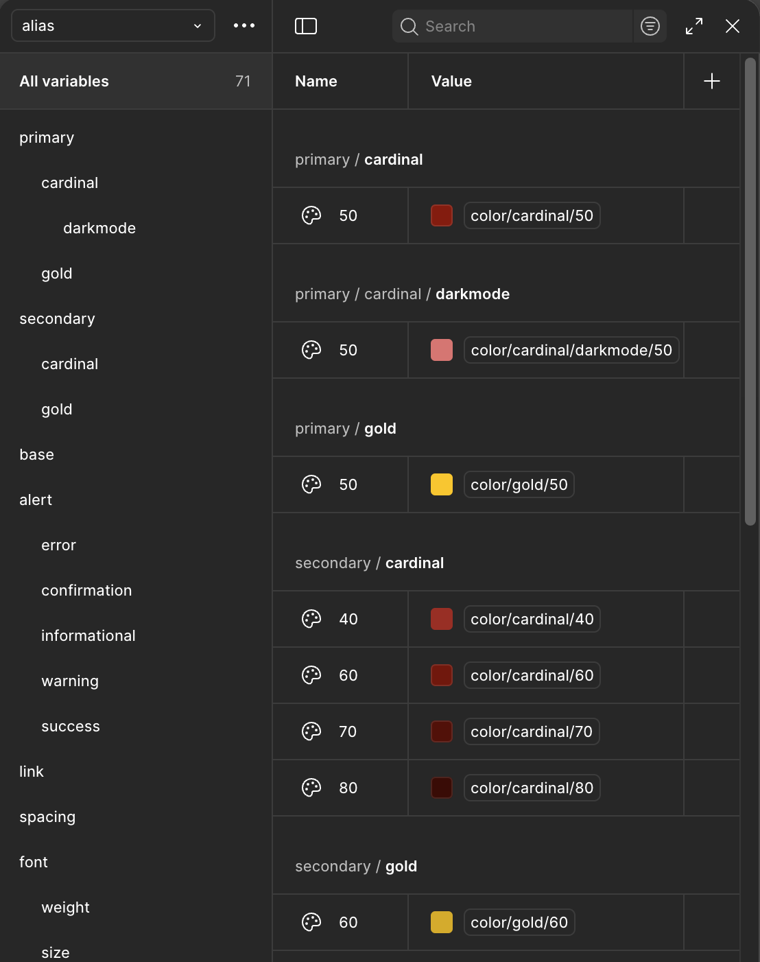
Alias Variables
Color page in design system showcasing our primary colors and their associated variables.
I was drawn to utilizing these features because of their ability to make updates that apply across the whole design system, reducing the need to update each component manually.
Incorporating Styles and Variables sped up our design team’s process and reduced ambiguity in which assets to use and when, which resulted in less one-offs and a reduced delivery time, which also increased the amount of producs we were able to release in a calendar year.
Change making process
To standardize our process of making changes or updates to the design system, I created and proposed a change making process that utilized a systematic way of making changes or updates based on researching other companies’ change management, like Google, Unilever and Prosci. Using Confluence, we documented and collaborated on this process as a design team.
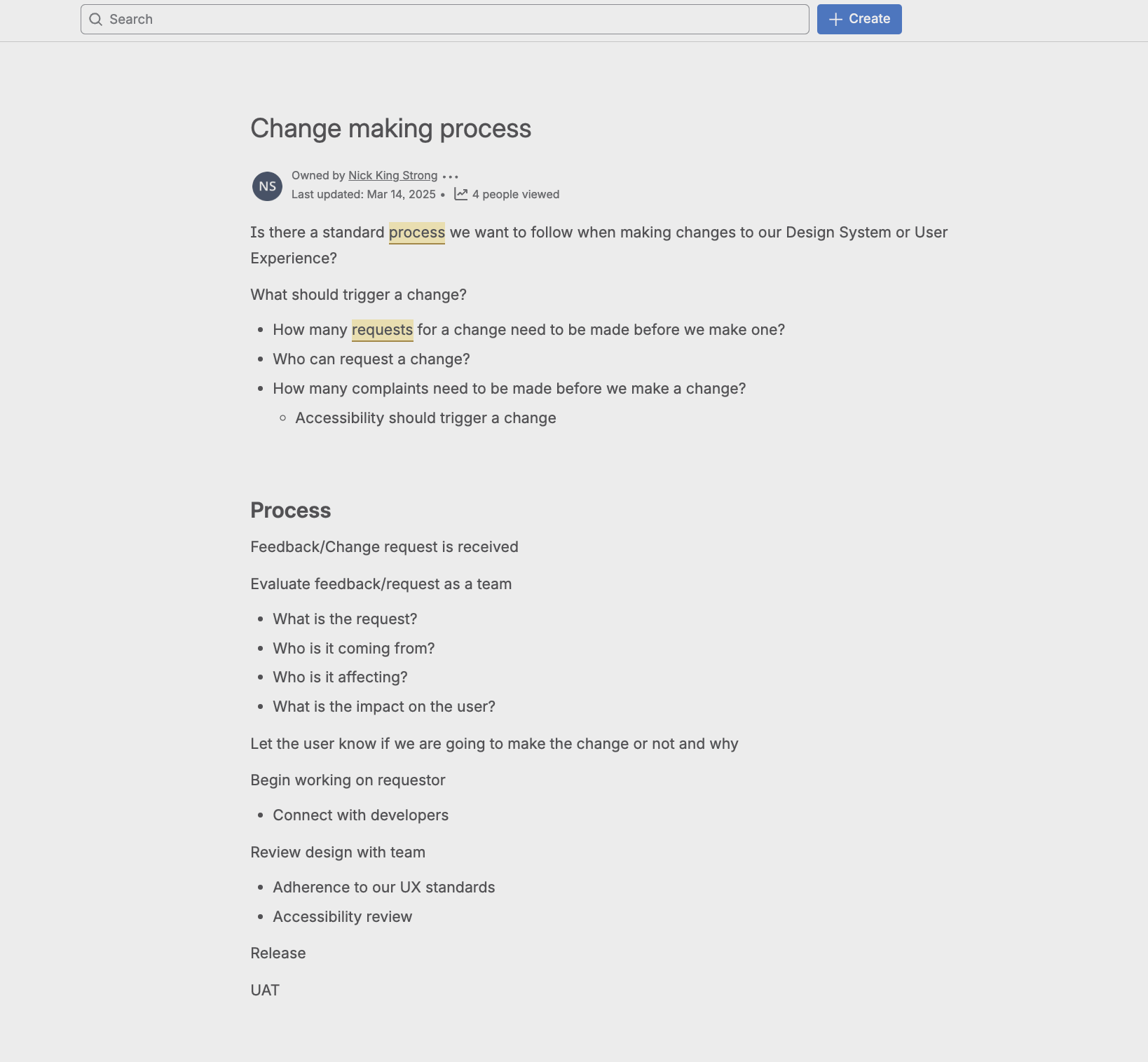
This model speifically focuses on collaboration, awareness and cohesiveness. Until this point, there was a lack of communication and awareness when a design decision was made, leading to the unawareness of certain components, which led to the creation of one-off’s and an inconsistent user experience. With this model, we are ensuring that designers, developers and upper management decision makers are aware of the current status of our user experience.
ITS Service Portal Redesign

The ITS Service Portal hosted by ServiceNow is USC’s IT service management platform where students, staff and faculty can submit support tickets or self-service technical issues for those seeking technical support.
We worked with Cask Consulting Agency in Phase 1 to create the initial MVP prototype of this portal, and after that it became self-managed by our team. To ensure nothing breaks code-wise in Phase 2, we opted to use only out of box components for all UI features, while implimenting our branding like logos, colors, typefaces, and icons. In phase 3, we focused primarily on accessibility remediation.
My responsibilities were designing and managing the User Experience of the portal as well as finding, reporting and resolving accessibility issues.
Phase 1: User Experience management
Because we were unable to change the DOM of ServiceNow without future updates breaking all of the custom changes we have made, we were limited to using as many of their OOB components as possible. With that being the case, we focused all of our efforts in making sure the user experience matched our branding as best we could. What we had control over were things like:
Colors
Typography
Logos
Icons
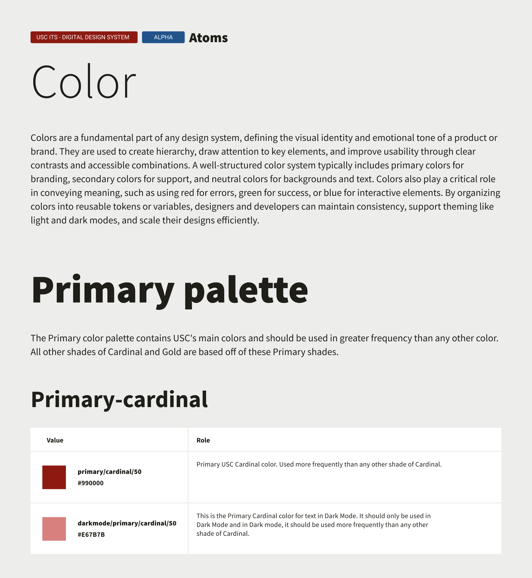
Colors
Primary color palette
primary/cardinal/50 - #990000
primary/gold/50 - #FFCC00
Secondary color palette
secondary/cardinal/70 - #630000
secondary/gold/60 - #DEB40B
Base
base/white - #FFFFFF
base/10 - #F7F7F5
base/50 - #77766F
base/90 - #1F1E18
Alerts
alert/error/50 - #E0182D
alert/confrmation/50 - #305718
Links
link/50 - #01548F
Typography
Source Sans 3
Logos

PrimShield_Mono_SmUse_Card-Wh_RGB
Icons
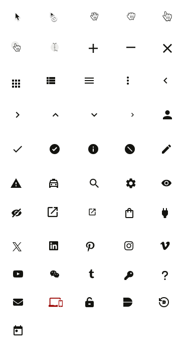
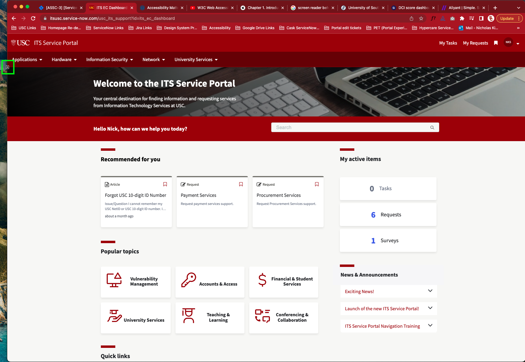
After all of our considerations, below is the initial portal design that we were able to produce given our limited capabilities.
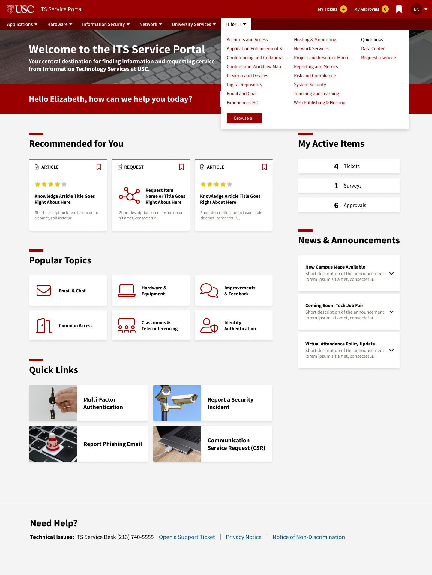
Initial portal design
With our initial portal created, we were then able to test the portal with our real users and receive feedback on our initial design while working within the restrictions of ServiceNow’s OOB layout and components. In phase 2 of this project, we focused on analyzing our user feedback and making design changes to the portal based on the most common and high priority feedback.
Phase 2: Design Remediation
Phase 2 was focused on ensuring the Portal reflects our established User Experience as much as it can given our limitations. In this phase, we focused on high priority and highly trafficked pages and components in the portal based on our user feedback. Those pages and components include:
Homepage
Primary navigation
Search function
Search results screen
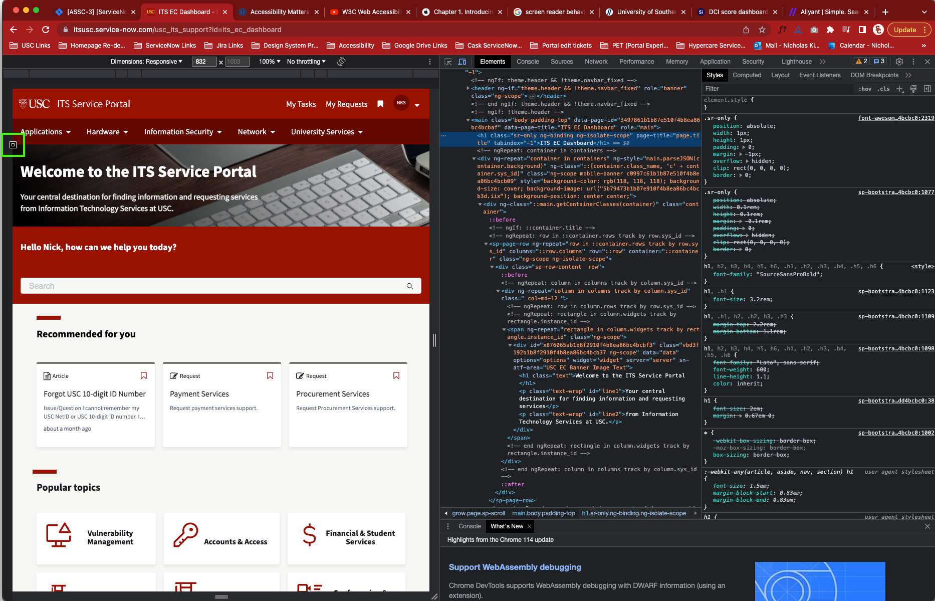
In our initial design, the homepage was found out to have a number of inefficiencies. Users informed us that we had an issue with our primary navigation. When a menu item was opened, often times the dropdown would obscure our search function, which was a core feature of our portal.

Old Homepage with menu item open
The users wanted to search for something immediately after they couldnt find it in the menu, and got lost when looking for the search function which led to a poor user exprience and the inability to properly self-service their issue. This resulted in an increase in calls and tickets given to our support team, which led to slower response and resolution times.
The color of the dropdown did not match our user experience as well, which confused the user in thinking they were using a third party service, and not an official USC product.
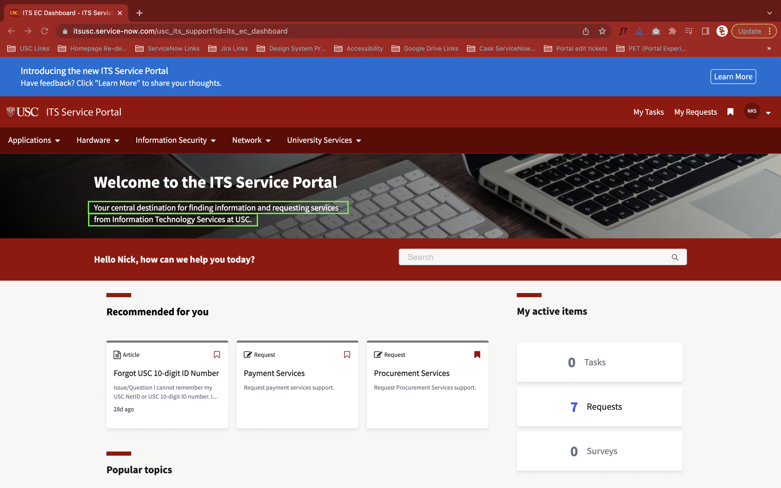
Our solution: move the search function above the primary navigation. This resulted in an increase in usage of the search function, an increase in self-resolution, a decrease in calls and tickets sent to our support line, and made sure that the search function cannot be obscured by anything. We also changed the color of the dropdown from white to Cardinal, which better matched the experience of our other products.
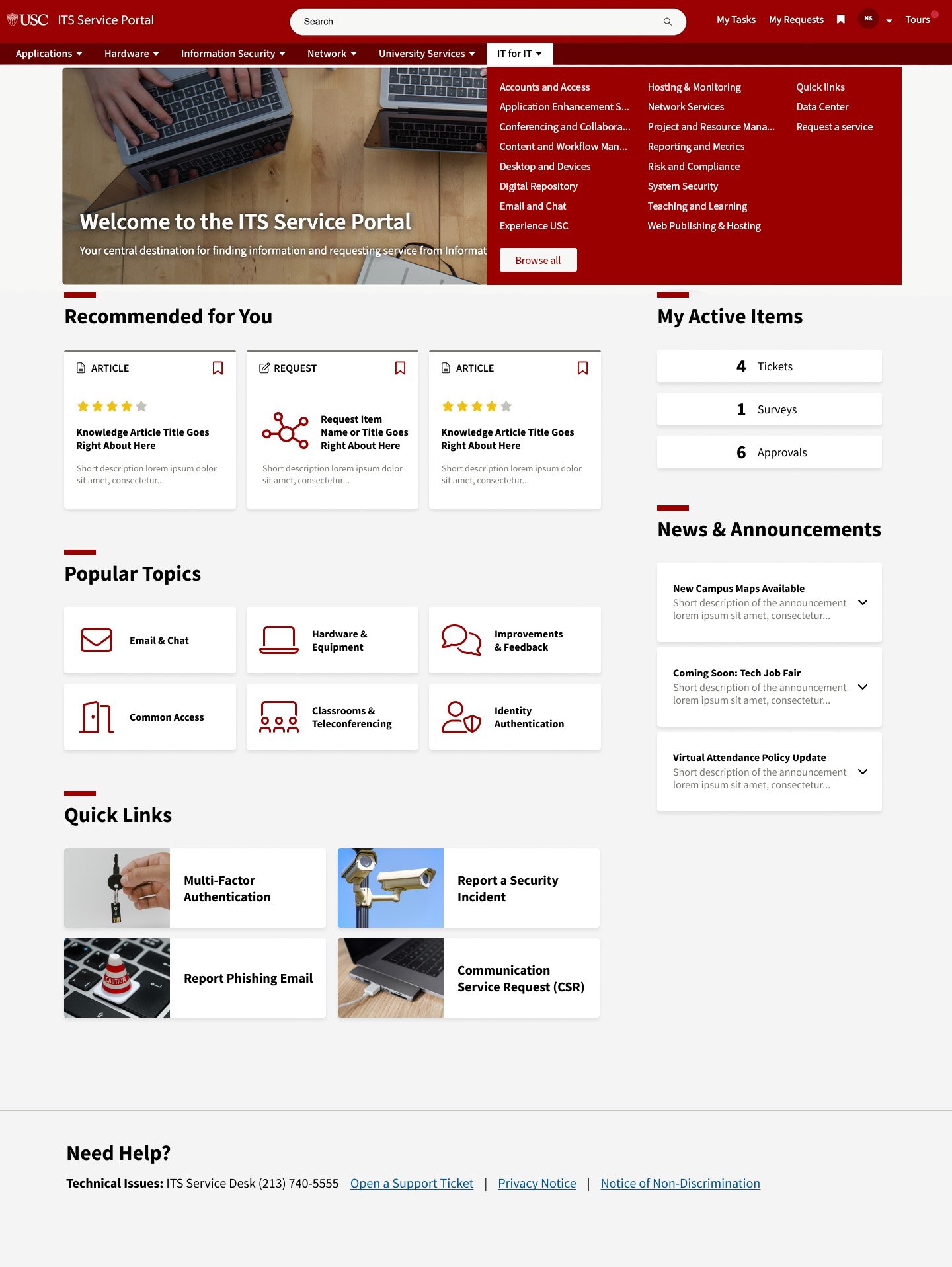
New Homepage with menu item open
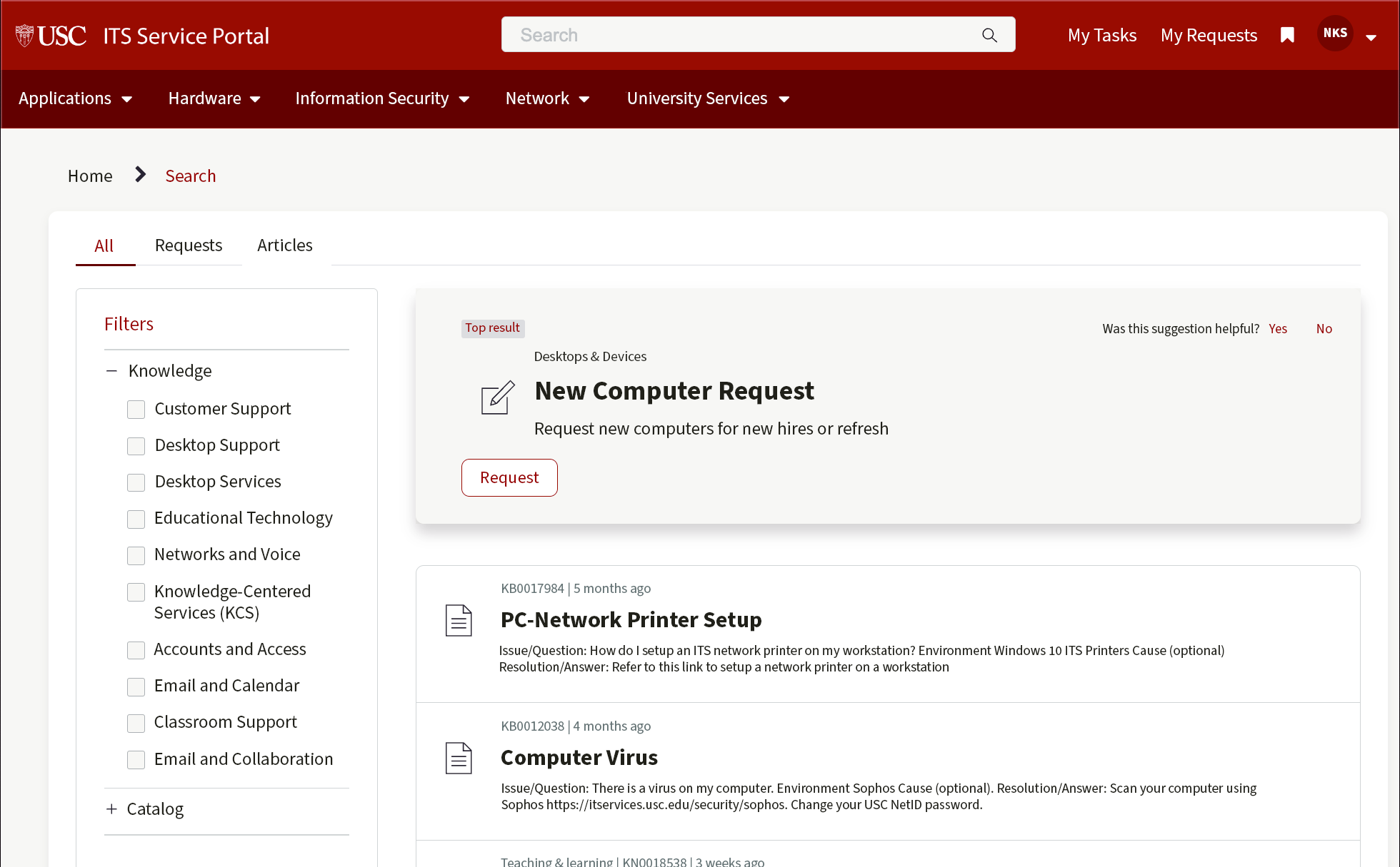
Search Results
The search results page had a number of cosmetic issues come up that threw users out of our established user experience, which made the whole search process seem unfinished and broken. First, when arriving at this page, our font was disabled across the whole page which threw users off as they felt like something was wrong with their computer and that they needed to submit a support ticket to resolve yet another issue. Second, a lot of the colors reverted back to ServiceNow’s default color pallete which didnt match match the other pages in the portal or anything else at USC. This led to an increased number of support tickets, calls to our support center and a user experience that made it feel as if something was wrong on the user’s end, not with USC.
Also, we noticed a number of gramatical and punctuation errors that existed which we resolved while tackling these other major issues.

Example of the search results page where users can select knowledge base articles where they can self diagnose and resolve an issue they are having.
After working with developers to update the font and resolve the user experience issues, we were able to bring the site up to USC’s established user experience. This resulted in less support tickets and calls to our support line, and instilled confidence in the user that the site is functioning correctly.
In Phase 3 we focused our efforts on implimenting user feedback and resolving accessibility issues.
Phase 3: Accessibility Remediation
In Phase 3, our goal put a lot more emphasis on resolving accessibility issues while responding to customer feedback and iterating our design.
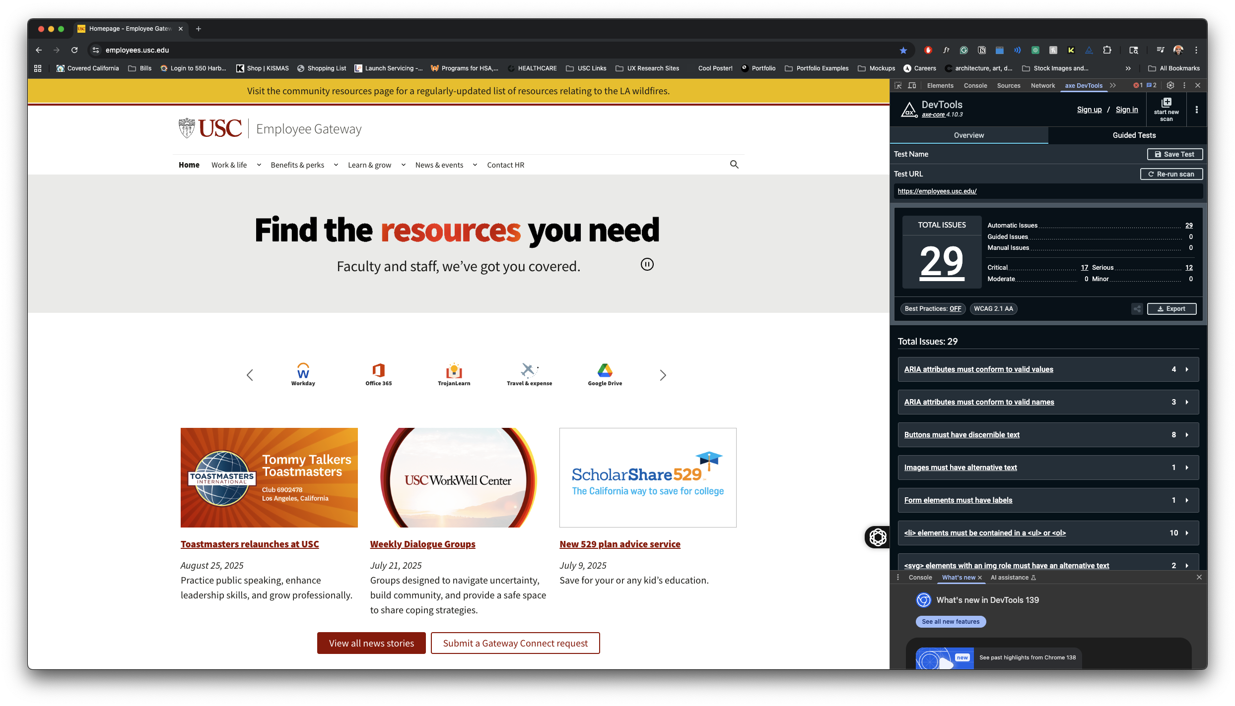
Our goal University-wide is to achieve a WCAG 2.1 AA rating on all of our websites and applications, so these remediation efforts aimed to reach that goal.
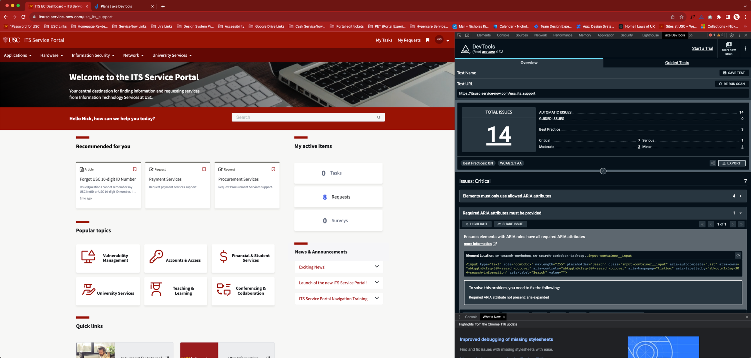
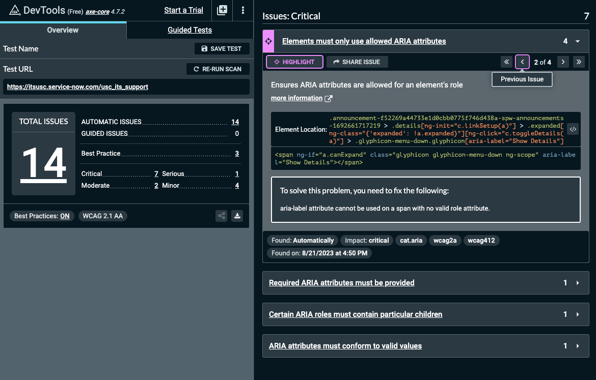
In our accessibility remediation process, we used Axe DevTools to discover over 100 accessibility related issues, but in this section I will highlight a few high impact issues that affected our homepage.
General accessibility audit
Using Axe DevTools, we ran an automatic test of our homepage and found 14 accessibility related issues: 7 Critical, 1 Serious, 2 Moderate, and 4 Minor. Our team focused on resolving all Critical and Serious issues to achieve WCAG 2.1 AA requirements.
Mega menu
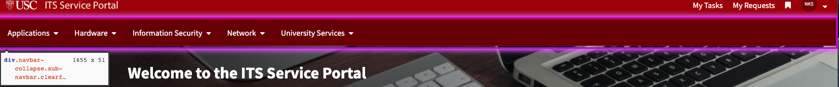
To solve this problem, you need to fix the following:
ARIA attribute is not allowed: aria-expanded="false"
This tag is applied to the code, but isnt allowed and shouldnt be there
<div class="navbar-collapse sub-navbar clearfix collapse collapsed hidden-xs" ng-class="{ 'in': expanded, 'collapsed': !expanded, 'sub-navbar--mobile-view': showMobileMenuOnDesktop }" aria-expanded="false" style="">When the child rows are hidden, aria-expanded="false" is set. aria-expanded="true" is set when the child rows are displayed. Rows that do not control the display of child rows should not include the aria-expanded attribute at all because including the attribute defines the rows as parent rows.
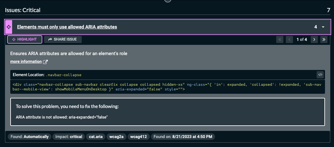
News and Announcements
To solve this problem, you need to fix the following:
aria-label attribute cannot be used on a span with no valid role attribute.
Search Form
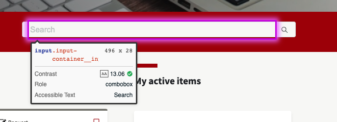
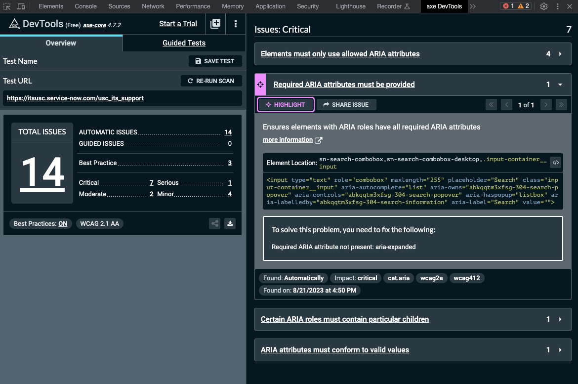
To solve this problem, you need to fix the following:
Required ARIA attribute not present: aria-expanded
This element needs the aria-expanded
My Tasks, My Requests, Bookmark, Profile
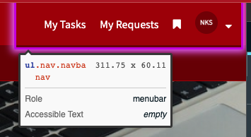
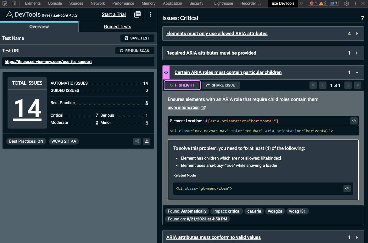
Critical issue
To solve this problem, you need to fix at least (1) of the following:
Element has children which are not allowed: li[tabindex]
Element uses aria-busy="true" while showing a loader
Tab order issues
A tab order is the sequence in which interactive elements on a webpage receive keyboard focus when a user navigates using the Tab key (or Shift + Tab to move backward). A tab order should move sequentially and in a predictable manner. The focus indicatior should move from left to right on the page and from the top of the page to the bottom, similar to reading a book.
Learn more container
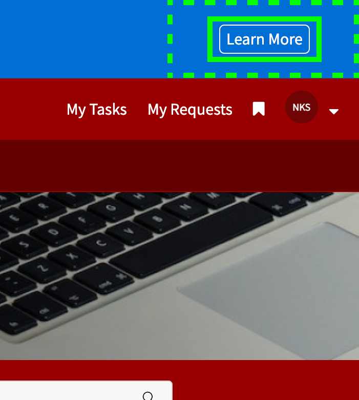
This is a container (dashed outline) that this button is insidethat receives the Focus Indicator before the button (solid outline) receives the Focus Indicator.
The container should not receive the focus indicator at all.
The tab order should go from “Skip to page cotent” to “Learn more”.
This issue doesn’t exist when using Apple’s screen reder
The container is ignored
My Active Items
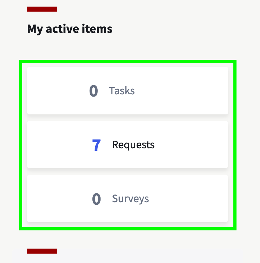
These cards receive the focus indicator in funcionality, but no focus indicator is visually shown.
The focus indicator should visually appear, individually, around each card.
Recommended for you
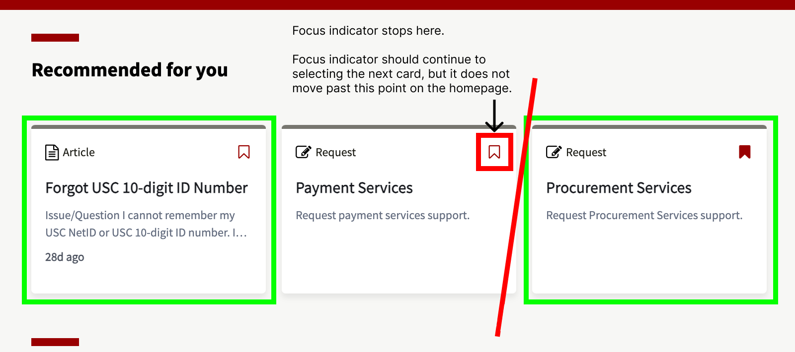
These 2 outlined cards never receive the focus indicator.
On the first card, the focus indicator goes from the “magnifying glass” in the search function, to the “bookmark” icon.
The card should receive the focus indicator before the bookmark.
The bookmark on the second card receives the focus indicator before the card does, but tabbing through the screen stops there. You are not able to tab through the screen any further. If you want to have your focus indicator reach the 3rd card, you need to tab backwards through the page.
The 3rd card has the same issues as the first card.
I was able to observe this functionalityby tabbing backwards through the screen.
Screen Reader Issues
When testing for screenreader issues, we used Apple’s VoiceOver tool. This was a very manual process, by running an AxeDevtools test then indivudually examine and document them individually via Jira and ServiceNow.
Blank H1 Header
There is a blank H1 tag that is picked up by the screen reader before the page title “Welcome to the ITS Service Portal”
Sub text under page header
The messaging under the H1 titled “Welcome to ITS Service Portal” are two separate paragraphs
Using 2 different <p>… </p> tags to produce 2 lines of text.
The screen reader is reading them separately
It stops reading the first line after “Services” and you cannot continue reading the next line until Tab it hit again
It should just be 1 <p>…</p>
Recommended for you
Has <h4> tag applied
Should be <h2> though
Not part of the Search component
Should this have a heading tag?
On IBM Carbon’s Search form component, the text is part of the component and is a labelText=”text input label”
(Refer to notion notes)
Currently the text “Hello Nick, …” text is not a part of the search form component and is a <h4> tag
If a <h#> tag is used, it should be <h2>
All Widgets
H4 tag should be applied to these widget headings
H3 tag is currently applied
Knowledge Base Article page redesign
Knowledge Base Articles (KBAs) are short articles or FAQs that explain to a user how to diagnose or resolve a technology related issue. They are a way for users to self-service their issues without having to rely on someone else.
Based on user feedback, we made adjustments to:
More visible and prominate search functio
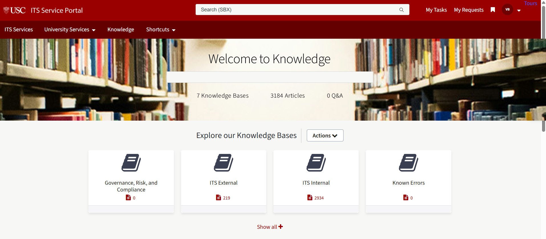
Phase 3 Knowledge Base Article search homepage renamed “Knowledge” showcasing all knowledge base articles.
Shibboleth SSO redesign
Shibboleth SSO is USC’s single sign on authentication process which provides secure access to University systems and allows a user to log in once with a single set of credentials. That allows the user to gain access to multiple applications, websites, or systems without having to log in again for each one.
Old Design
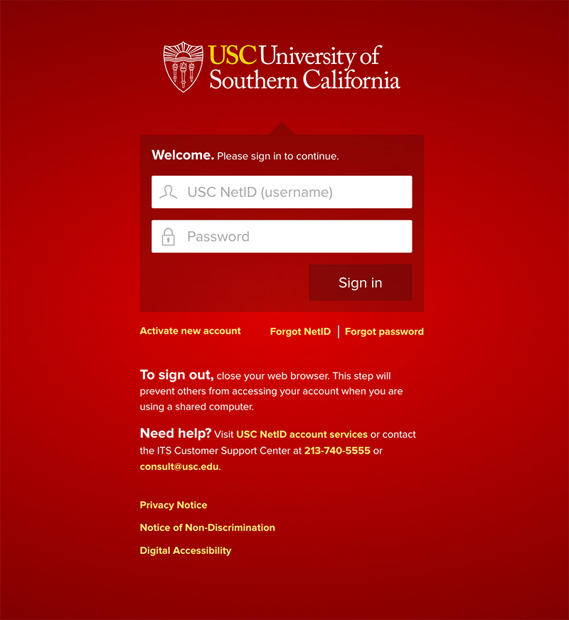
The old design had multiple issues. First, and most apparent, is that the red screen was jarring to a lot of users and had a gradient on it which violated our design system guidelies. Second, this page did not reach WCAG 2.1 AA levels for accessibility in terms of tab order, screen reader, and color contrast ratios. Third, this screen did not follow any current design guidelines and was created before those were established, so it needed to be updated to our latest design stadards.
New design
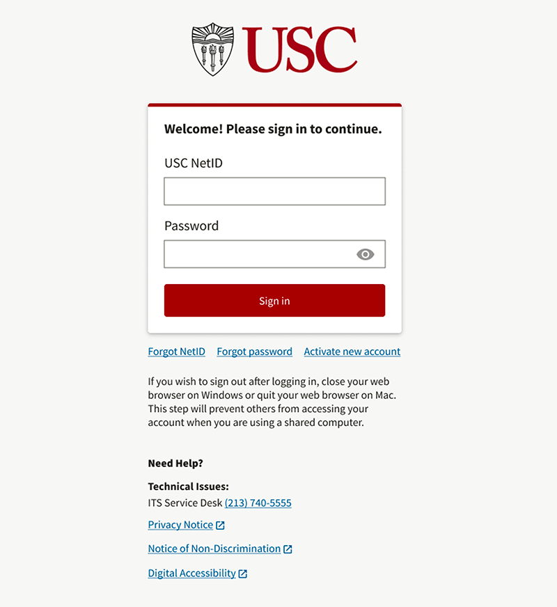
The redesigned Shibboleth SSO widget resolved our accessibility issues by incorporating a logical tab order, proprerly labelled HTML semantics for a screen reader and color contrast ratios that exceed 4.5:1 for small text and 3:1 for large text and Graphical Objects and User Interface Components. We also removed the bright red gradient background with a neutral, flat background which matched the experience of our other products. Lastly, we replaced all of the elements and components with our up-to-date, established elements and components from our design system like the typeface, colors, form inputs, buttons, and links.
Custom Sites
Sites at USC is a high-quality, self-service option for building, hosting, and maintaining public websites at no cost, and is available to faculty and staff. I was responsible for receiving a custom site request and reviewing the request to see if it meets our requirements. If it does, I was responsible for creating the site and incorporating the requested theme, site title and site tagline.
There were 2 themes for the requestor to choose from: Cardinal and Unlimited. Cardinal more closely reflected the experience of the other USC sites and products theming, while Unlmited provided a more visually forward theme that incorporated more visual elements like photos.
Cardinal Theme
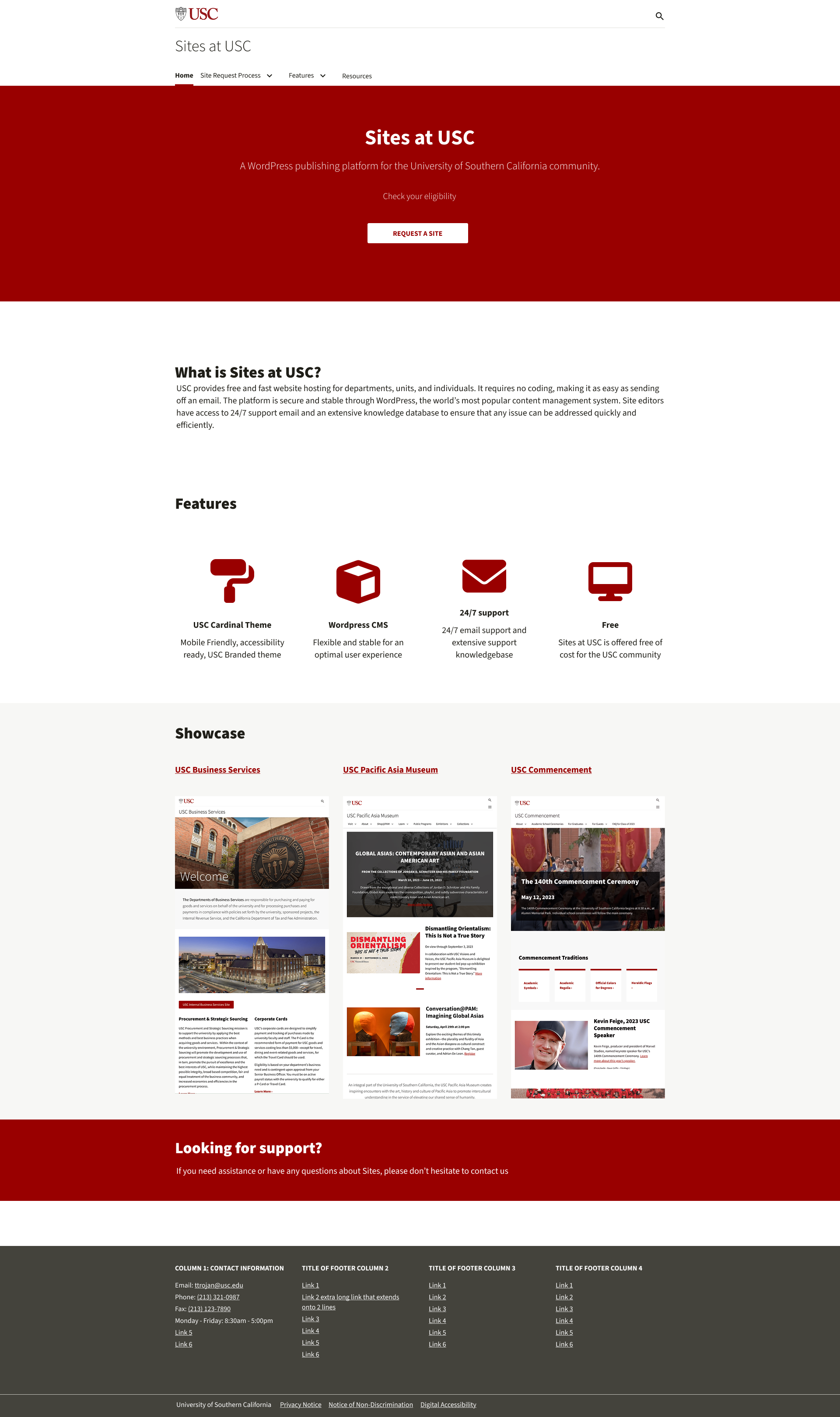
The Cardinal theme incorporates styling that better matches our other sites (ex. president.usc.edu, change.usc.edu).
Accessibility Remediation
Our focus for 2025 was to ensure all of our products meet WCAG 2.1 AA requirements for accessibility. I took on the role of auditing our sites and applications to ensure they adhere those standards.
To do so, I used Axe DevTools to run audits on the sites, and took educational courses througn Deque university like:
IAAP CPACC Certification Preparation course
Fast Track to Accessibility for Designers
Introduction: Accessibility Fundamentals - Disabilities, Guidelines, and Laws
My process was to run an Axe DevTools test, then to manually test for accessibility issues. when manually testing, I would ensure the tab order is correct, heading levels follow the proper structure