ClubLabs: AAA Auto Club’s digital acceleration team.
Building intuitive customer experiences across AAA.
I was approached by ClubLabs in December 2021 because AAA had recently developed a UX department within their digital team. Because of that, ClubLabs was in need of UX Designers and Researchers to implement UX fundamentals to their design process.
With ClubLabs, I worked on 4 different projects over my 5-month contract:
Discounts & Rewards Prototype
ADA Screen Reader Bug Fix
Discounts Widget UX Solution
Wifi Landing Page Design
All work performed was required to meet WCAG 2.1 guidelines for accessibility.
Discounts & Rewards Prototype
AAA offers exclusive Discounts & Rewards to its members which can be redeemed online and locally.
To show the user that their membership has value, AAA wanted to create a module for the user that shows how much money they have saved by using Discounts & Rewards.
I was asked to create an MVP for this project, as well as 3 Post-MVP states where I elaborated on the concept to show the future potential of this module.
Market Analysis
To start out this project, I began by looking at how other discount and savings platforms handle redeeming discounts and displaying user savings over time. I aimed to find out:
How discounts are presented
How a price cut is displayed
How savings are shown
How a search function operates
1. How discounts are presented
I instinctively looked at coupon and discount applications like Groupon and Honey to see how they display their discount offerings. I wanted to see how they design a digital coupon/discount, how much information is initially given before redeeming, when is a CTA given to redeem the discount and how much information the user needs before redeeming.
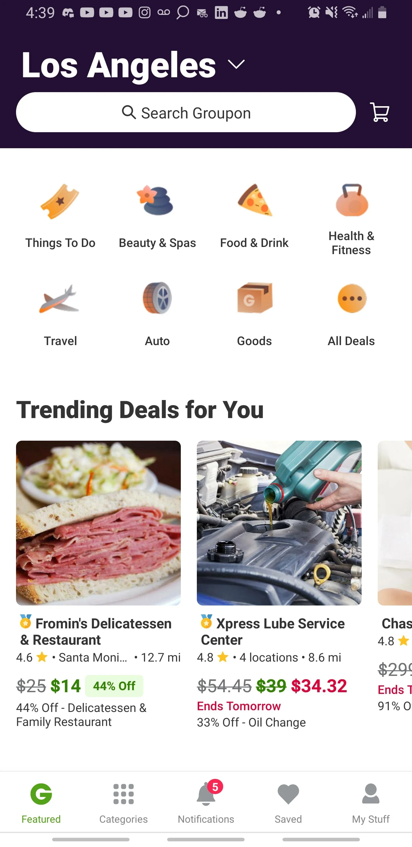
Groupon

Honey


As you can see, in both the Groupon and Honey example the design of the discount remains the same throughout the process of browsing for and clicking on a discount. If a discount is initially presented on a card, it should remain on the card after you select it, and vice versa. Also, I found out that it is not uncommon to present discount and savings information before tapping on the discount. However, the amount of information can be overwhelming unless the user is looking specifically for a certain amount of savings or savings threshold.
2. How a price cut is displayed
Most online retailers offer price cuts on their offers or in the checkout process. Since we wanted to implement a familiar and proven way of showing that change in price, we looked at applications like Honey and retailers like Amazon since they are key players in the online discounts and e-commerce industries.
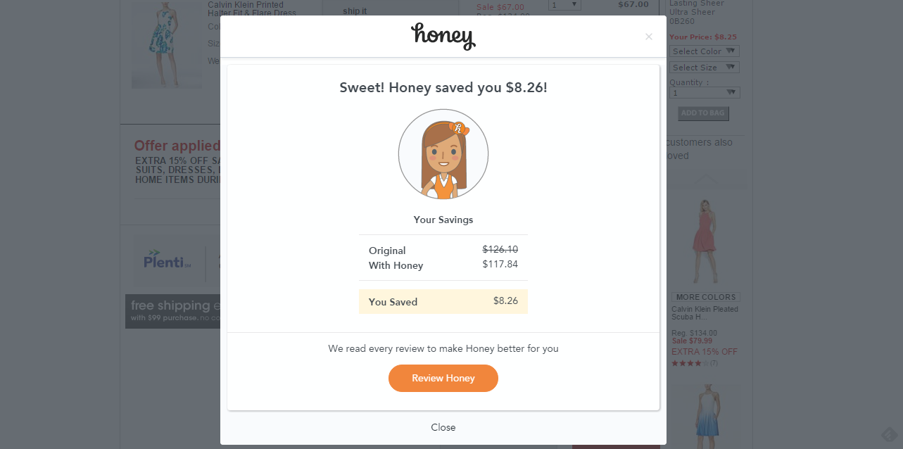
Honey

Amazon
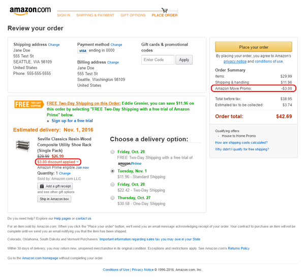

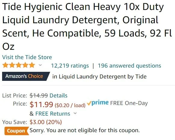
Most price cuts and in-cart savings are shown in an equation-style layout with a visualization of the price difference. In these cases, a slash through the old price, or a color coated price change like red or green is displayed to show a new price or money saved. These examples clearly highlight the savings incurred and the change in price from the old price to the new one.
3. How savings are shown
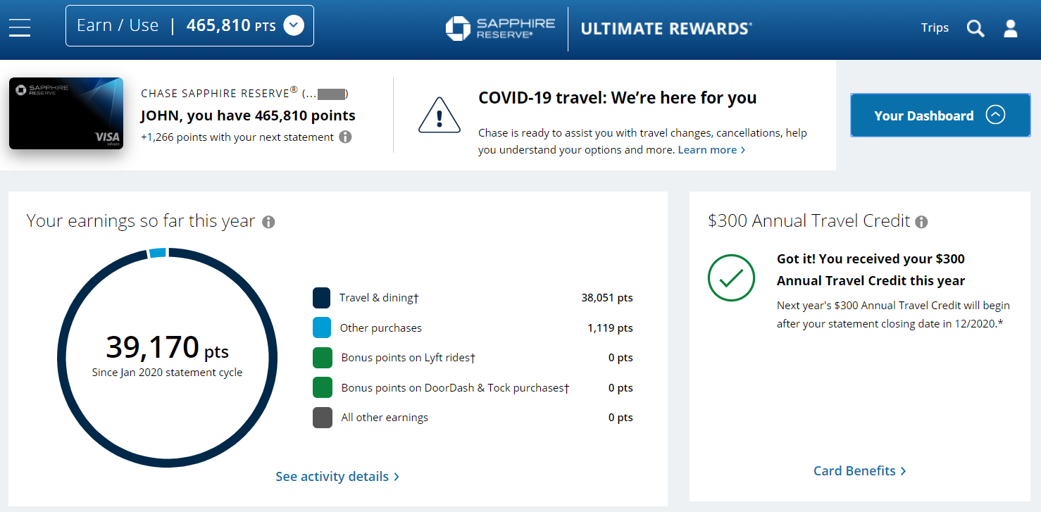
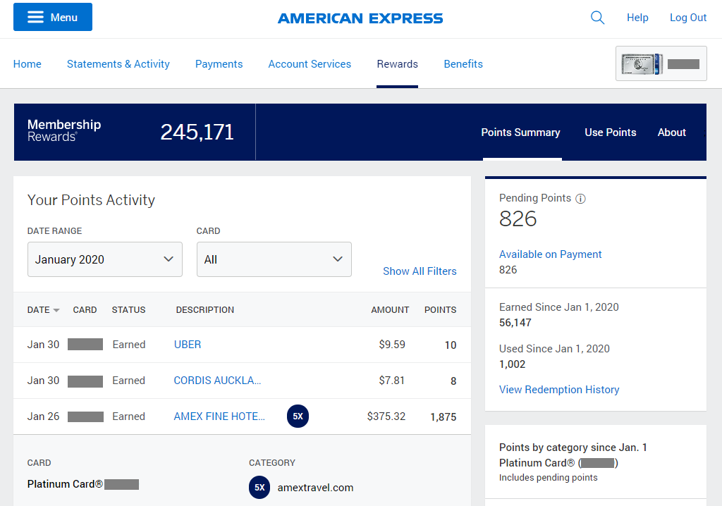
AAA has 9 different discount categories to choose from. Each category is given its own color to distinguish itself from the other and I wanted to show how to best display the savings that the user has incurred in each different category. By looking at credit card savings programs and online coupon and savings platforms, I was able to gain inspiration on how some of the biggest players in the industry display savings by category.
Chase Sapphire rewards breakdown
American Express Membership Rewards
Instacart


Visualization of total savings
Rakuten

Visualization of total savings
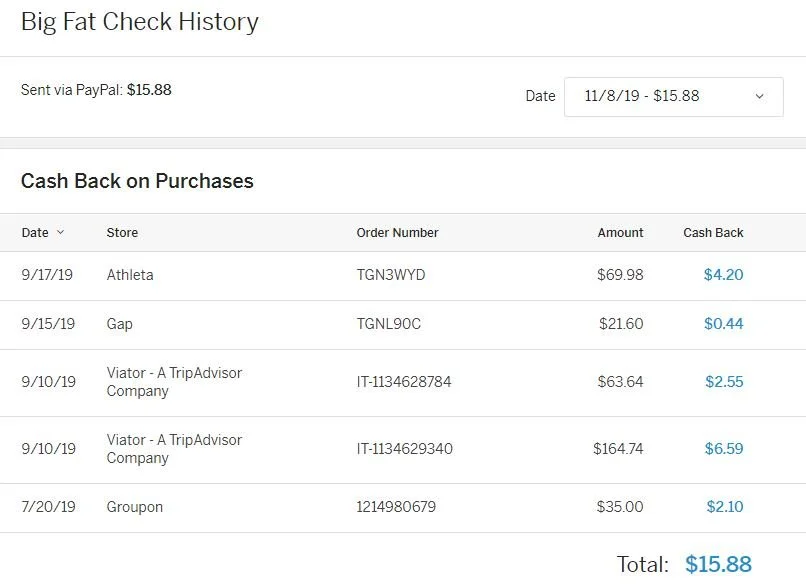
Savings breakdown of individual discounts
In the Chase, American Express, Instacart, and Rakuten examples, the user’s savings is prominently displayed to show the value of their membership. In the Chase example, they do a great job at showing rewards/savings incurred by purchase category. Individual purchase savings are also shown in detail in the American Express and Rakuten example.
Instacart is smart with how they display user savings by showing savings incurred over the past 12 months. This is a great idea because, given the user takes advantage of these savings frequently, the user always sees a high savings value because the savings don’t reset every week, month, year.
4. How a search function operates
Before implementing our search function, I was tasked with researching the UX of how a search function should operate as well as best practices associated with searching for information on a website. AAA had yet to do a thorough UX analysis of their UI for search functions, and wanted me to find an optimized solution for this process.
To determine how our discount search feature should operate, I consulted online articles and chatted with our developers to determine best practices and feasibility for implementing this search function.
Research article: “Best Practices for Search”
https://www.uxbooth.com/articles/best-practices-for-search/
This article highlights some of the best UX practices for search functions and covers the do’s and dont’s associated with looking up information on a site with thousands of searchable data points.
Here are my main findings:
Prominently display search function
Make search box easily noticeable an accessible
Don’t hide or collapse
Accompany search box with a search icon
Icons help identify search function with a low level of effort
Most search icons have universal recognition
Clarify what users can search for
Hint to the users what is available to search (if you need to specify your search, if you can search by keyword, if you can search for multiple criteria, etc).
Use an auto-suggest
Auto-suggestion reduces user effort and guides them to their desired outcome
Users are generally poor at constructing searches
If they don’t find results quickly, later search attempts are even less effective
Speaking with Developers
I also chatted with our in-house developers about their ability to implement the search function and any blockers they could foresee experiencing.
When consulting with them, I aimed to find out how many search results to display before needing to load more items. They mentioned that the number of search suggestions displayed would ultimately rely on load times associated with the page. More items could be displayed if load times are fast, and less items if load times are slow. However, we wouldn’t be able to definitively determine that until they started hard coding the concept.
Prototyping
After gaining inspiration and design direction from our market analysis, I started prototyping the concept. To start prototyping, I referenced the market analysis as well as our style guide to create the initial design.
Process
As far as our design process goes, I would spend a day or two researching the problem and creating a solution for that based on my research and feedback. Then I would schedule a meeting with the Senior UX Designers, who I would then present the concept to. They would provide feedback and UX guidance to my flow, which I would then interpret, research, then implement. This process was repeated weekly over my 5-month contract.
Prototype & user flow:
We used Miro to present my designs and user flows throughout the process. Below is a Miro link to my final solution for this Discounts & Rewards concept based on my market analysis findings and feedback from peers.
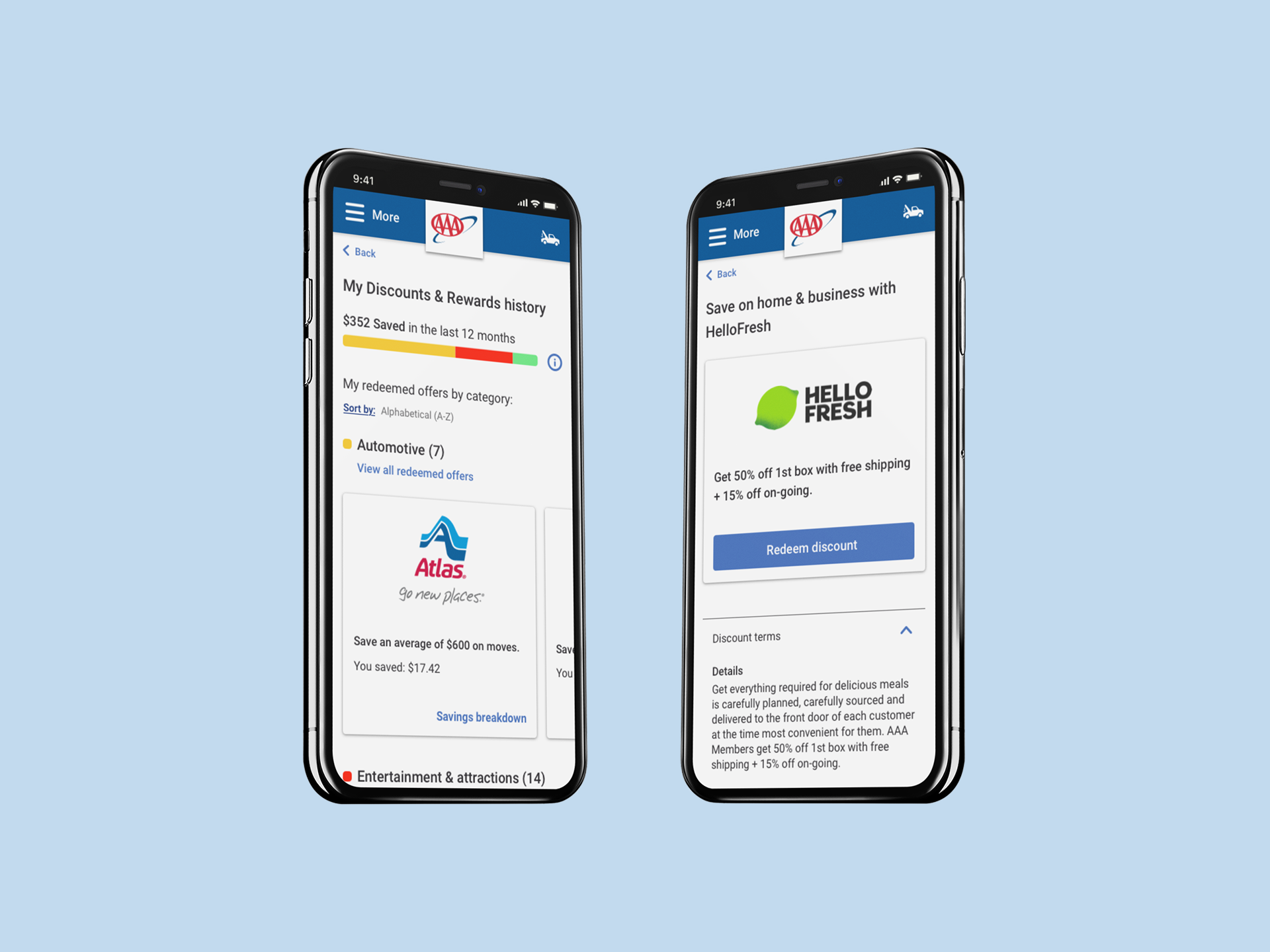
The MVP of this concept aims to simply show the Member their savings from using Discounts and Rewards in the past 12 months.
To show this, I added a Discounts & Rewards savings module underneath the Travel blade that shows the Member’s 12-month savings.
I also created a notification on the 1st of every month that displays their previous month’s savings to serve as a friendly reminder of the value of using Discounts & Rewards. If the user did not use Discounts & Rewards in the previous month, the notification reminds them of the value of Discounts & Rewards and provides a link to where they can view and redeem more.
MVP
In Post MVP 1, the MVP concept is elaborated upon and gives the user a the ability to search for and redeem Discounts & Rewards all in one place.
Post MVP 1
In Post MVP 2, the notification displays 2 notifications and shows how the screen would react in that situation.
Post MVP 2
Post MVP 3 shows what would happen if the user had not recieved any Discounts & Rewards savings over the past 12 months.
The Discounts & Rewards module displays $0 dollars in savings, and replaces the “View all savings” button with a direct link to the Discounts & Rewards search function.
Post MVP 3
ADA Screen Reader Bug Fix
The developers on my team ran into a bug when running ADA compliance checks for screen reading software developed to help the visually impared. In order to remain ADA compliant, I was called upon to create a UX solution for this error that achieves the desired result but with a different approach.
Problem
When the user requests personal information, an error pop-up modal would appear if there were an error in the information provided.
The bug comes in when the screen reader tries to read the error modal pop-up. Instead of reading the pop-up, the screen reader would start reading the text on the screen behind the pop-up again, instead of reading the text in the pop-up.
Because of that, the developers needed a UX solution to help fix this issue.
In this final step, the screen reader reads the everything on the first screen well, but when the pop-up modal on the second screen appears, it re-reads all of the text behind it again instead of just reading the text in the modal.
We found out that the issue was the loading time it took for the error modal to appear. It took too long for the modal to appear, and because of that, the screen reader started reading the text behind it again before it was able to read the modal text.
Solution
After brainstorming with the senior UX team, we decided to eliminate the pop up modal and put the error message on the screen itself.
In our solution, placing the modal error text on the screen instead of in a pop-up window solved the loading time issue that was triggering the bug in the first place, since there is no modal to be loaded anymore. Also, when the error appears, the screen reader will only read the error instead of reading all the text on the screen again.
Discounts Widget UX Solution
The discounts widget is displayed throughout the Discounts section of the website and includes tabs for five categories of information, plus search.
Currently, a member is able to easily enter an infinite click loop if they select a category, select “shop” in that category, then select the category again, then click “shop” again.
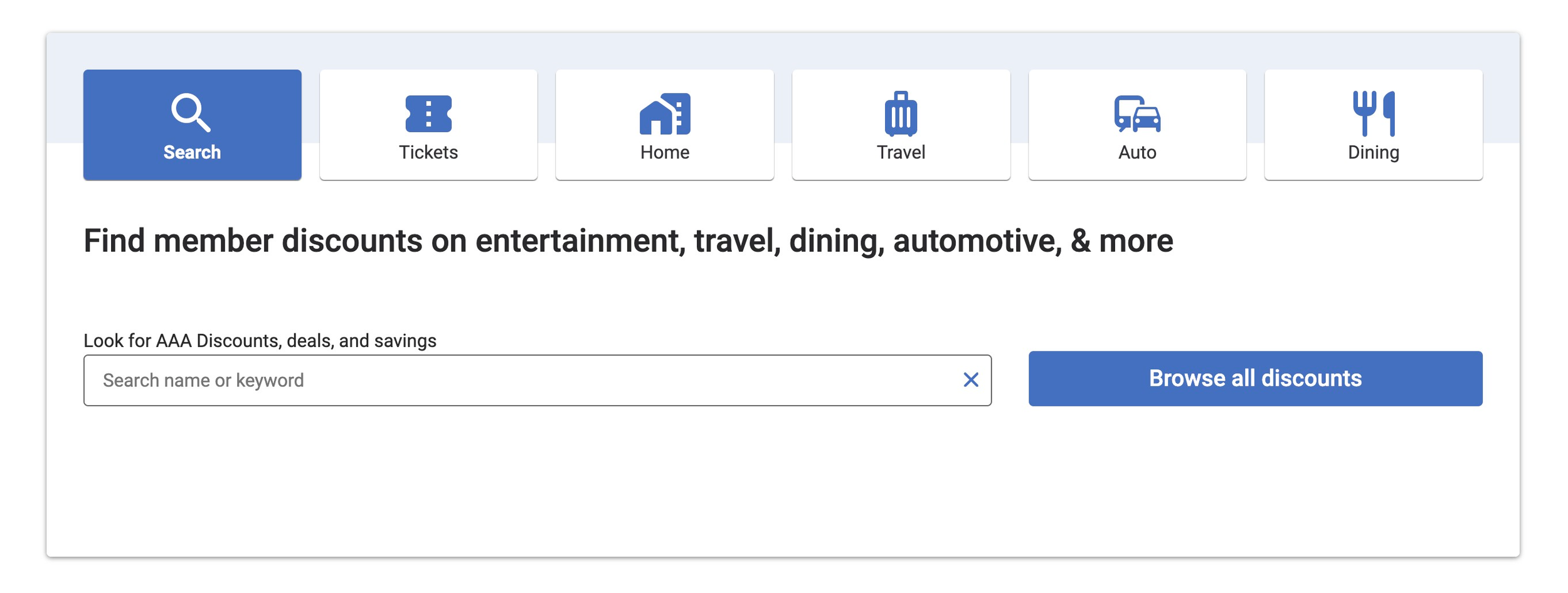
Discount search widget
Problem
In any category in the search widget, the user can select “Search” then click that same table again, where the “Search” button appeared again, allowing the user to click through that loop over and over.
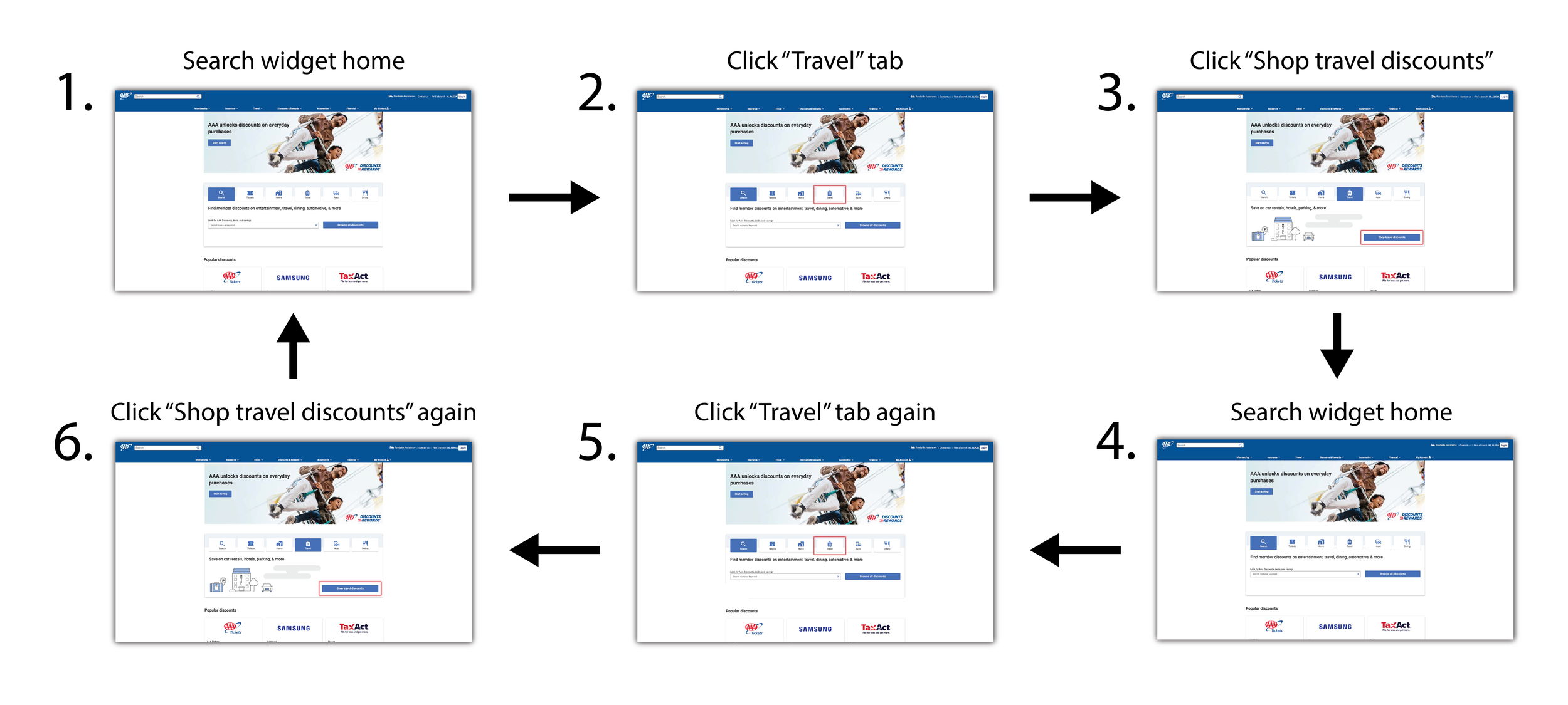
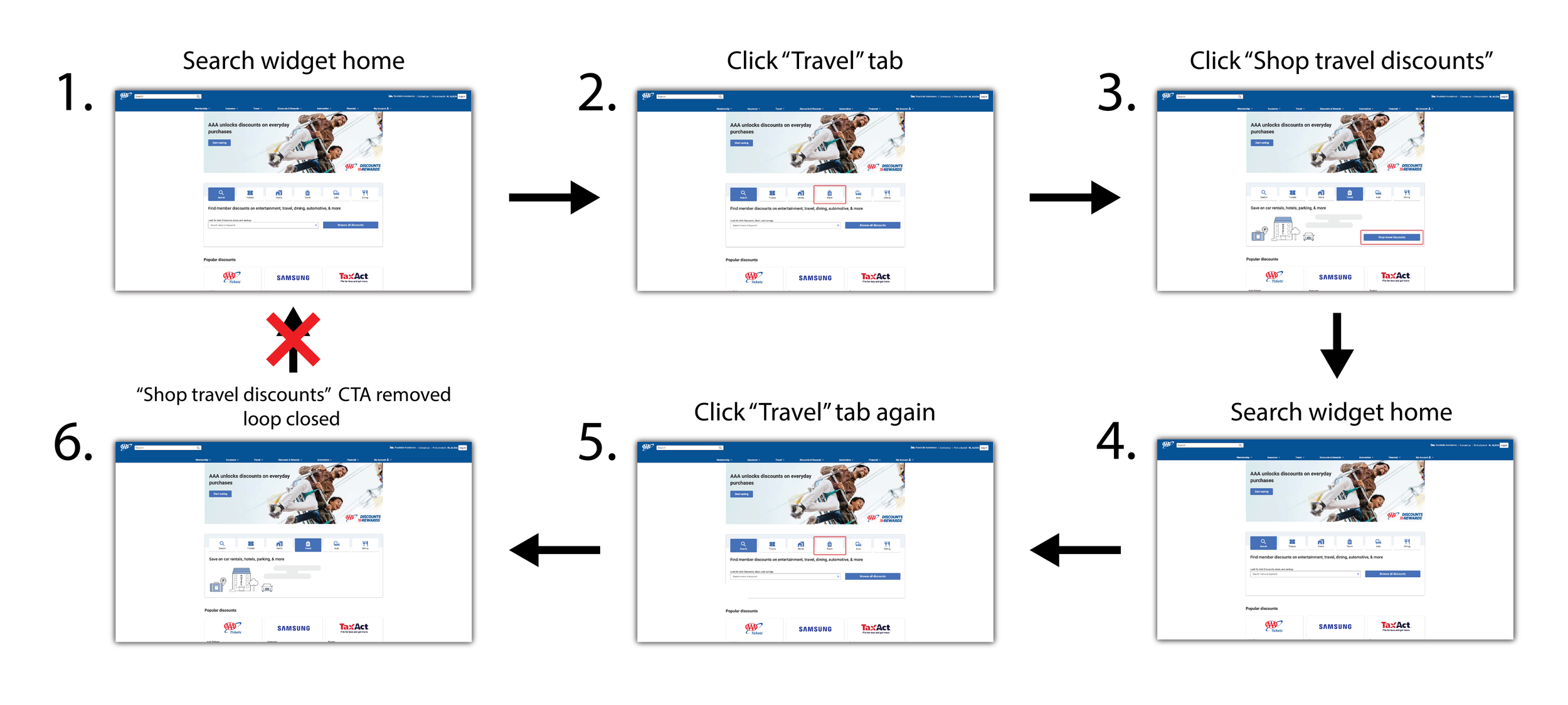
Solution
To resolve this, after the user has already selected a discount category tab, I chose to remove the “Search” CTA from the selected tab. That way the user cannot re-select the search button after they have already selected it, closing the loop.
Wifi Sign-in Landing Page Design
When a AAA member walks into their local AAA branch, they can enjoy complimentary wifi during their service there. Currently, when they try and sign in to the wifi, they are presented an unbranded, generic page where the user can accept the terms and connect.
Problem
AAA is currently losing out on a cross-selling opportunity when users log into wifi at an in-person branch. The wifi landing page lacks AAA style guidelines as well.

Current Wifi sign-in page
Solution
Redesign the wifi sign in landing page to be presented with AAA’s most current style guidelines and by providing cross-selling opportunities for other AAA products.

Redesigned Wifi sign-in page

Sign in confirmation page with cross-selling opportunities